Savings Tool UX/UI for Web
TableUp is a SaaS startup that creates digital products for the restaurant industry. As the in-house UI/UX Designer, I worked with the marketing team to demonstrate the potential revenue increase TableUp’s guest retention platform could bring prospective small business owners using their real data in order to create a “fear of missing out” on the extra potential cash flow.

I was provided with a spreadsheet which contained predictions of how the use of each module of TableUp’s platform would increase revenue at a prospective restaurant, based on their real data.
The creative brief explained that the “Guest Retenton Calculator” would work by asking restauranteurs a series of questions to estimate their restaurant's current revenue and then compare it to a higher revenue, calculated by adding projected increases according to the TableUp products they are interested in.

We went through the traditional UX process starting by conducting research, creating user personas and flows leading into wireframes and UI prototypes.
We made some big changes that made the product more effective after some user research that pushed us to pivot strategies.
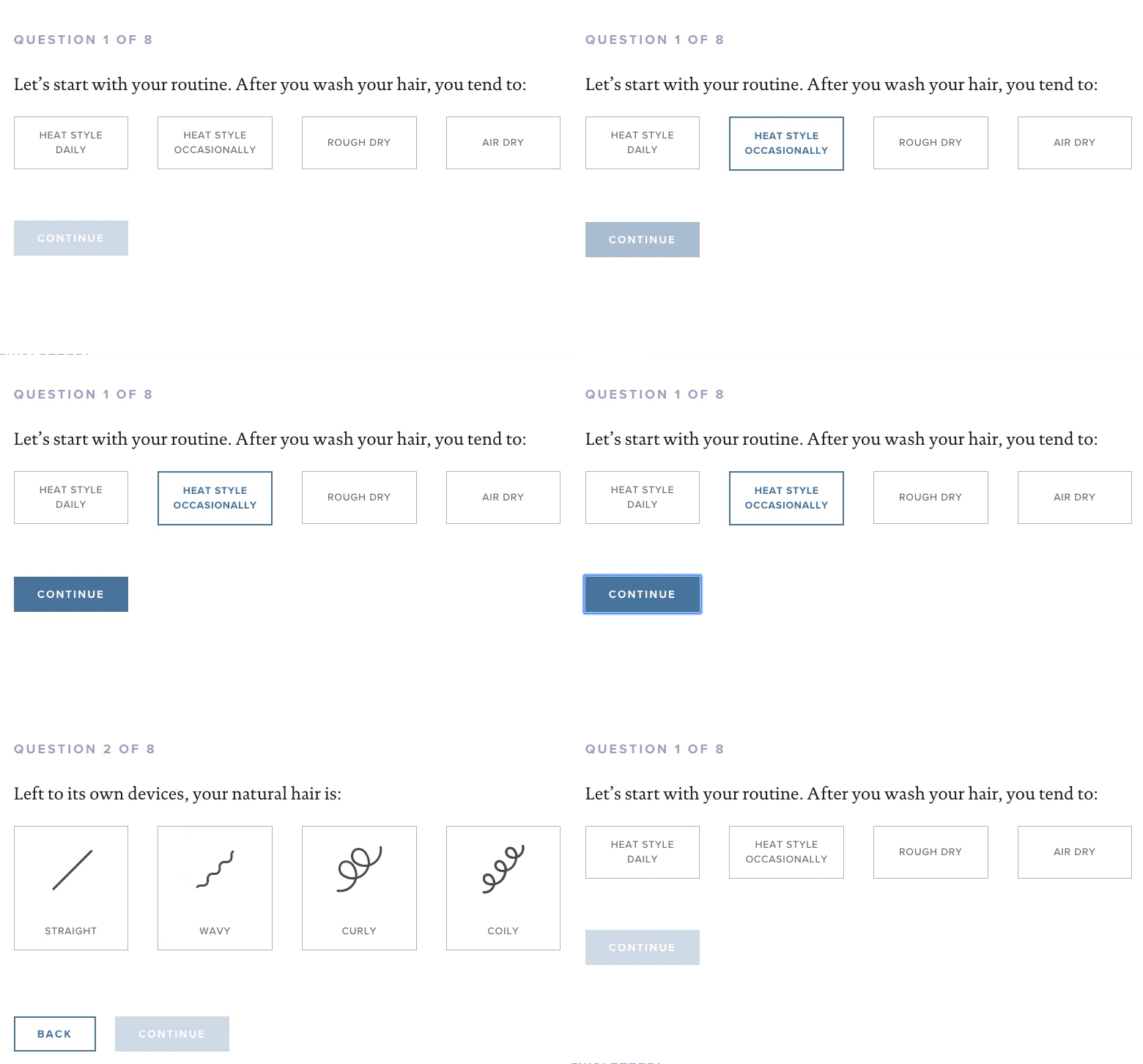
I began my research by looking at companies that offer intense product customization and assessing their UI/UX, user flows, information architecture and overall visual design. Although in a completely different industry (upmarket hair care), Living Proof has had great success in tailoring products to customer needs in a way that is fun and playful for their users.

Our users are primarily restaurant owners or general managers, they are incredibly busy and have a lot going on to manage at small-medium businesses. For this reason, our results needed to be quickly accessible understood at a glance and effectively make the case that changes to their restaurant would provide a generous return on investment.

Presented with a binary series of questions in the form of a Google Sheet, I created a decision tree that allowed users to self-select the parts of TableUp’s platform that would be most beneficial to their business.

Informed by a reviewed and revised user flow, I created pen and paper wireframes, breaking the questions into digestible steps and beginning to visualize the established information architecture.

Based on the sketches, I moved into Sketch App to create wireframes and further explore how the calculator would live within the website.

Because this experience was text heavy and fairly rigorous, I sought to use animation (prototyped in Invision Studio) to both delight the user and explain how the steps fit together.
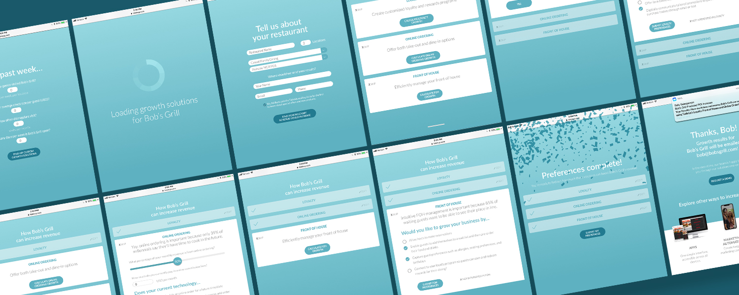
I explored the UI, keeping the design simple and on brand with no distractions from the main content.
USER TESTING
Here is one insight I got from a restaurant manager at this stage:
“ I clicked on the Front of House option first because not interested in Loyalty Programs or Online Ordering.”
I incorporated this feedback by making the modules easily skippable from users for which they were not applicable.
User testing also revealed easy fixes such as the need to make field labels clearer and giving context to some of the questions.
Overall, it was well received and we felt ready to move into production
“This (quiz) is how I can sell to the restaurant owners. It shows how are you going to make me revenue and save me time”
—Restaurant General Manager

Before moving into development, we were provided with provided with a new data sheet to base the quiz off of so we took our learnings and were back to square one.
Competitive analysis
Different competitors for this calculator style of the ROI calculation tool rather than binary Yes/No questions we had designed around in the initial versions.

The new User Flow was more linear than the previous as the answers affect the numerical results but not the course of the questionnaire itself.
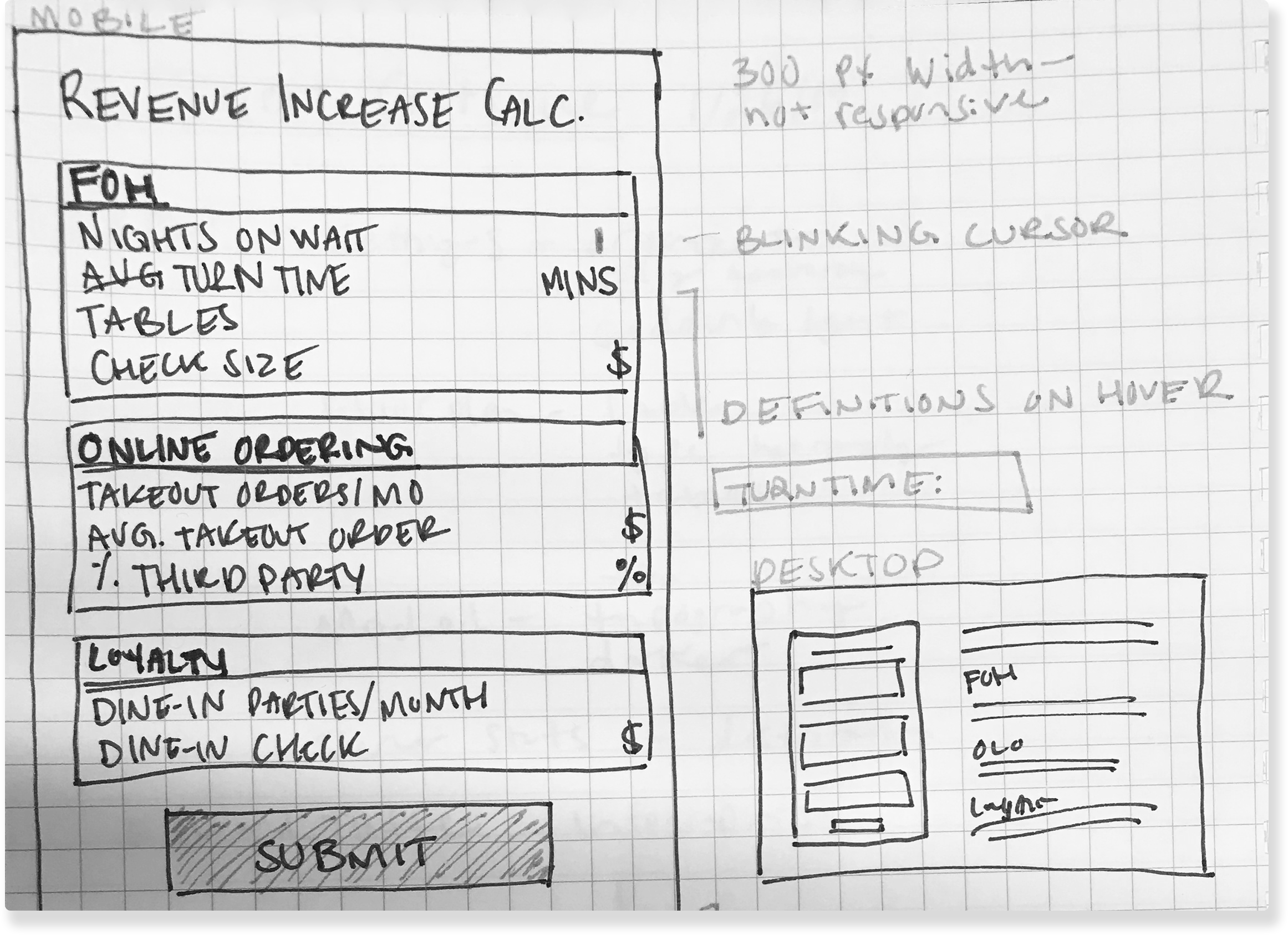
The new wireframes visualized how I planned to lay out the input fields and allowed me to begin the feasibility conversation with our developer before beginning design.
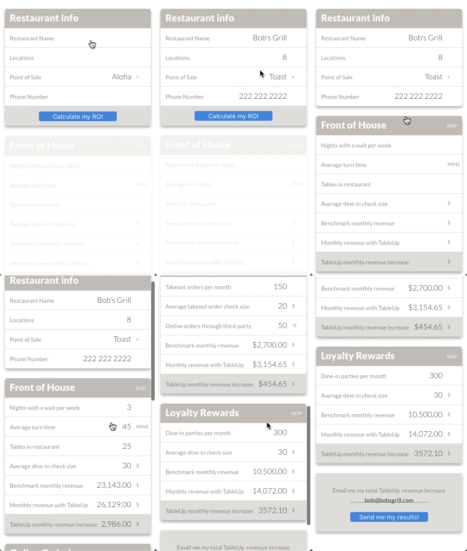
After sign-off from the management team and web developer, I created wireframes based on the new sketches in Sketch App and introduced interactivity with Sketch Cloud so they could see how the calculator would work before I approached the visual design.
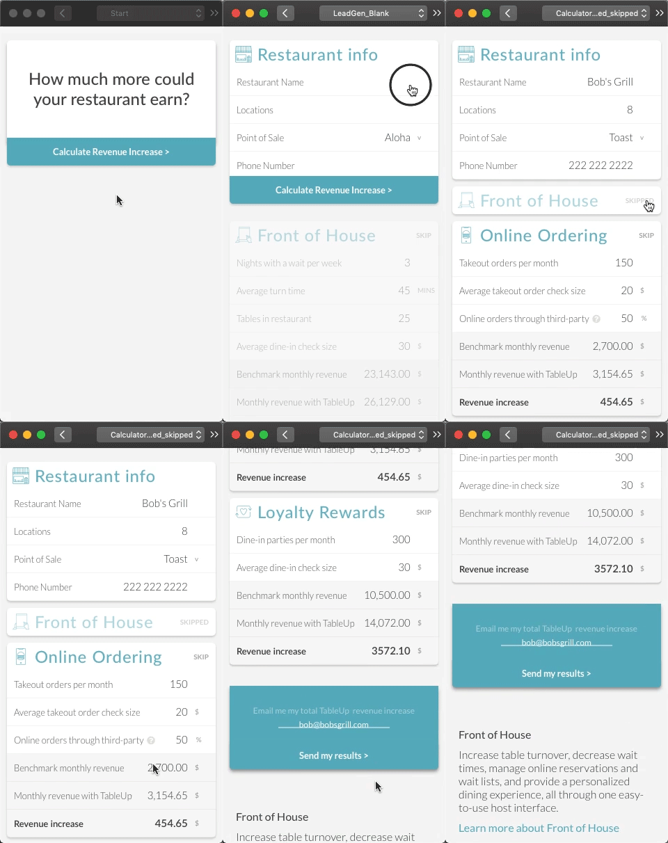
I gradually built up the UI, once again keeping it simple and on brand.
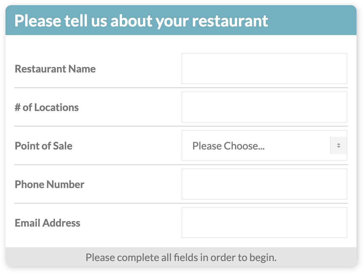
I worked closely with our developer to ensure the calculator worked as intended and looked cohesive with our website and other brand assets.
We made changes to the calculator as it began being used such as the results delivery method, instructional UI writing, and phrasing of questions.
View the calculator at tableup.com

