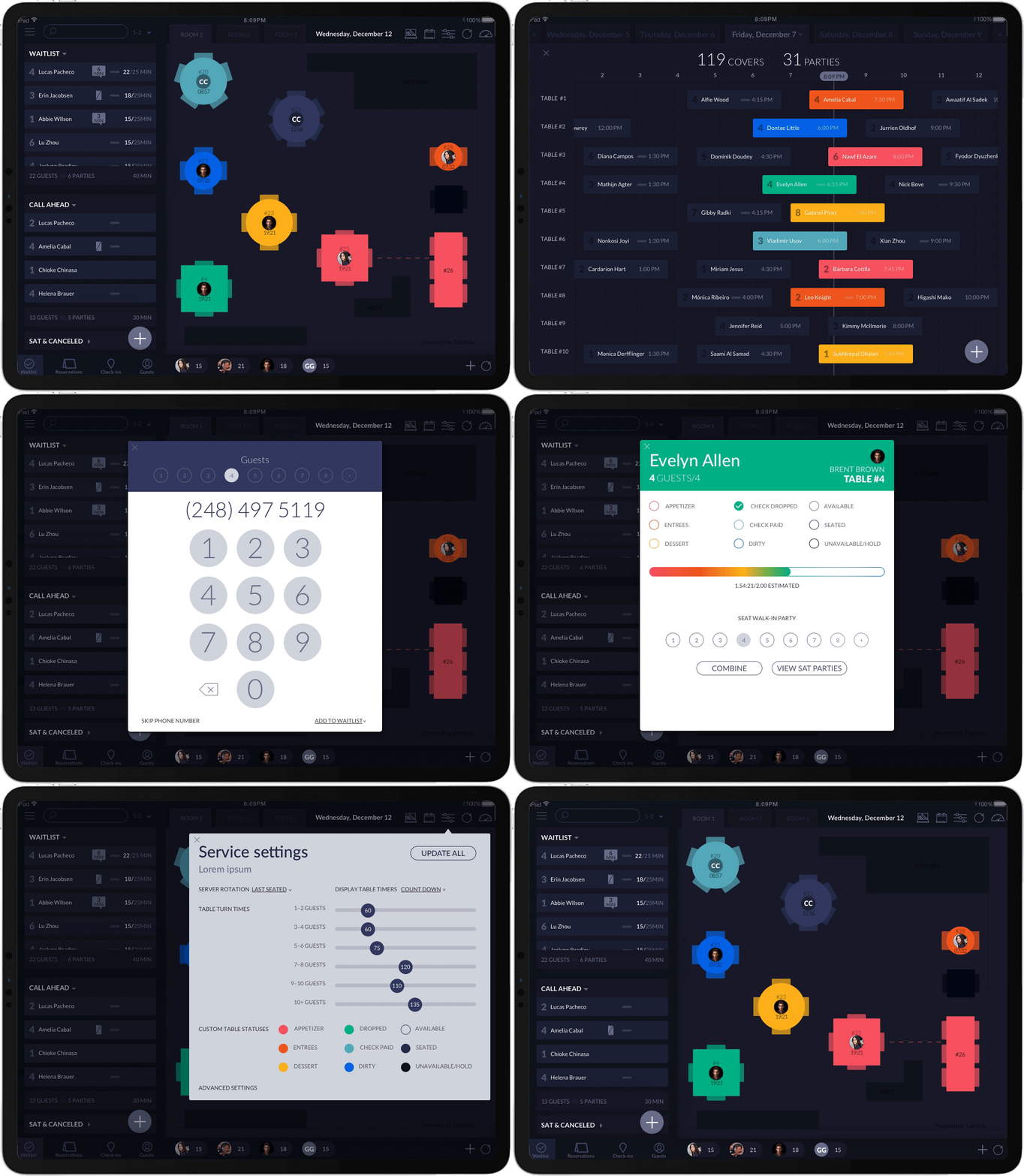
Mobile App UX
Improving user experience though apps for restaurants and their customers in an agile environment.
Stay tuned for more to come.

I used the UX process to improve satisfaction by enhancing the usability and accessibility provided in the interaction between a user and a product in order to figure out what users wanted and iterating.

Regular restaurant guests need ways to easily order food, make reservations an view menus and their loyalty program status because otherwise they will delete unused apps.
MY HYPOTHESIS
I believe that by simplifying and re-flowing the restaurant’s app for it’s customers, we will achieve higher guest retention. We will know this if the restaurant receives higher orders and interactions via it’s new app.
STAKEHOLDER NEEDS
Business reasons for redesign the app (above) include higher guest retention, less need for customer support, increased sales and improved brand perception.
We seek to find an approach that meets both the business goals and user needs while being technically possible.
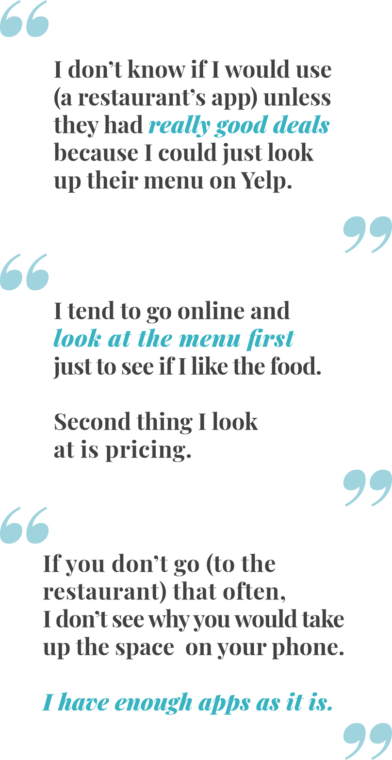
I reduced risk by validating needs beforehand and ensuring that the problem I was solving actually exists in our user’s lives. In order to do so, I interviewed four recruits about what they did and did not like and use in the apps they currently have downloaded.
I also asked participants to rank features ranked by average perceived importance

By conducting a competitive review I was able to set standards for feature offerings, design principles and criteria for design.
CONTEXTUAL INQUIRY
By describing a task for the participant to perform and asking them to tell me what they were thinking and why they did something I was able to observe what delighted and what frustrated users in completive applications.

I summarized trends from my research into representative archetypes in order to create user personas to make design decisions based upon and highlight pain points.
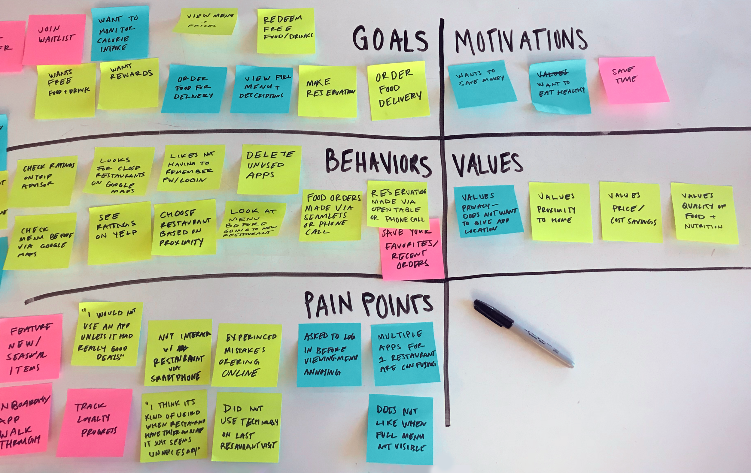
I used affinity mapping to analyze and group information by: goals, motivations, values, behaviors, pain points in order to discover actionable insights.
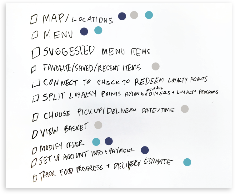
I had a lot of ideas on how the app could be great, but needed to narrow down the key features to be included in the minimum viable product (MVP) for testing.
Using the dot map method, a heat map revealed which features were most essential to completing the user’s goal.
I also assessed who was benefited by each feature and prioritized those which benefited both the restaurant and it’s guests.
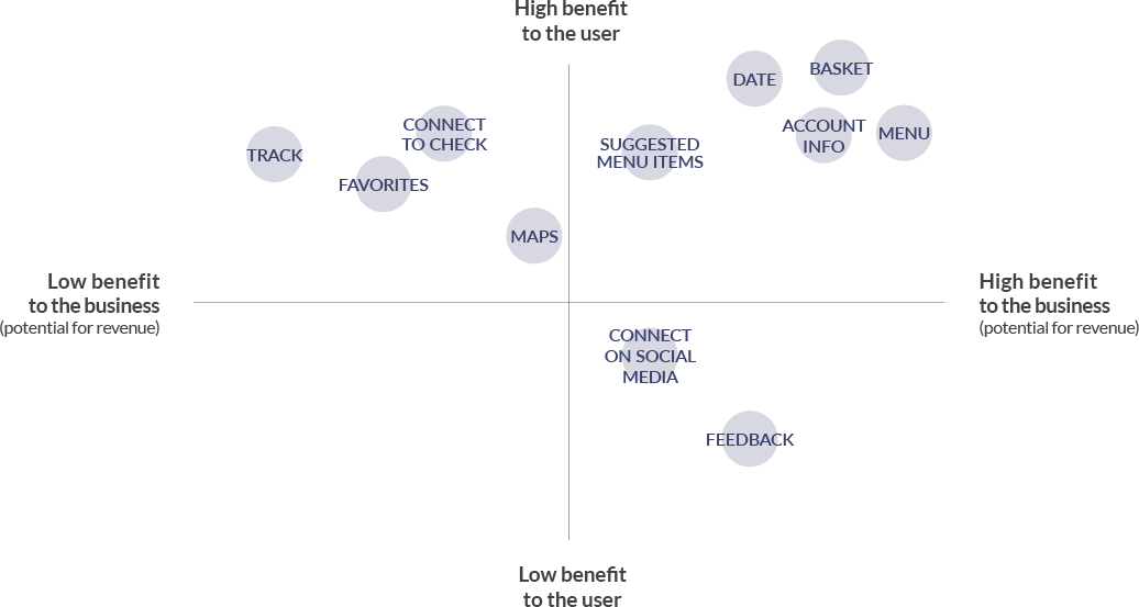

I mapped out (and iterated on) the user flow in order to uncover gaps in the system that need attention and outline all the technical inputs and outputs.

I used an open card sort activity to determine where users expected to find certain content and therefore how to group it.
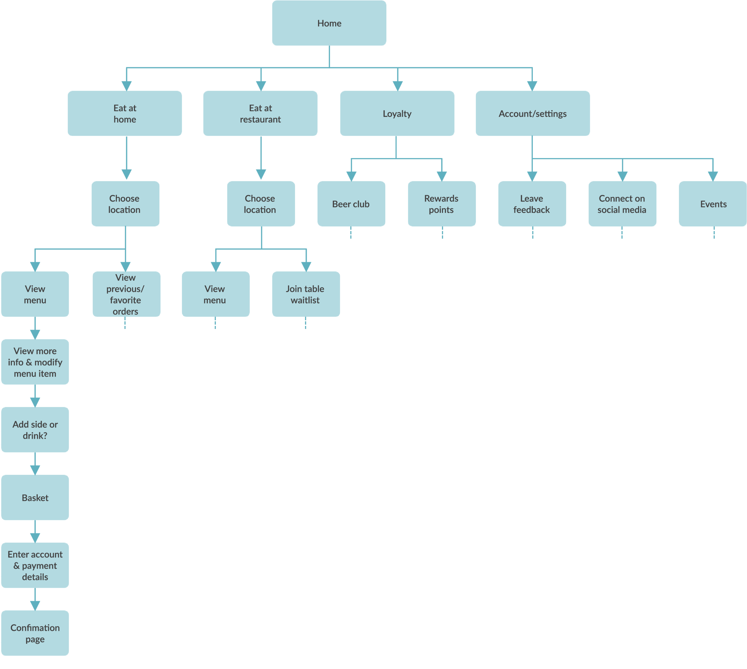
After updating the user flow based on the card sort, I was able to create informed information architecture for the primary user flow.

Before committing too much time or resources, I wireframed, tested and iterated the proposed design starting with pen and paper.
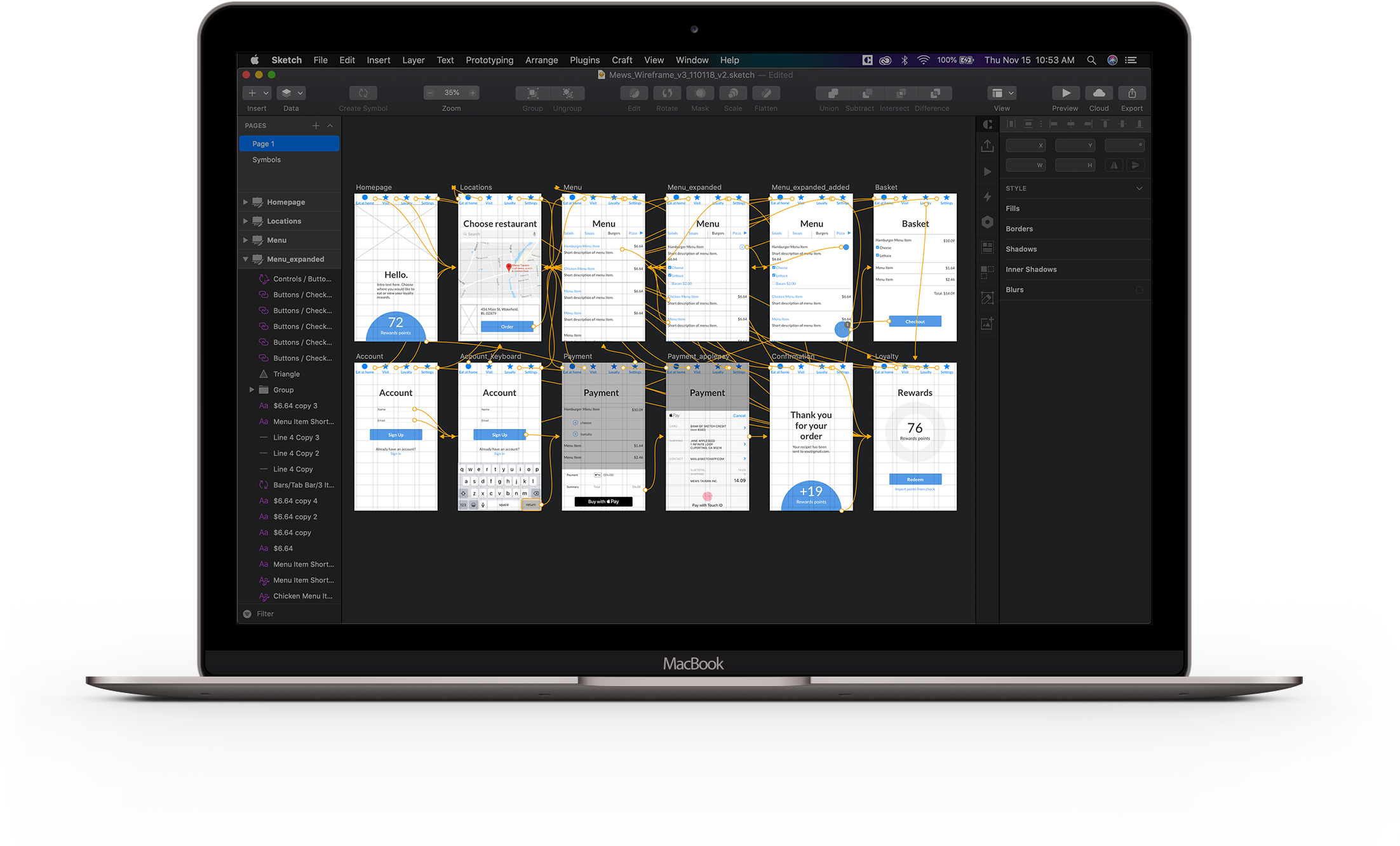
Applying insights from the paper wireframes, I created higher fidelity wireframes Sketch to test before design. I used no color besides blue, to indicate interactivity.

I designed the UI for the high fidelity prototype in Sketch and created the interaction in InVision.
ONBOARDING
I focused heaving on onboarding new user to the app in order to reduce the visuals on the app’s main screens and because the users tend not to be tech savvy.
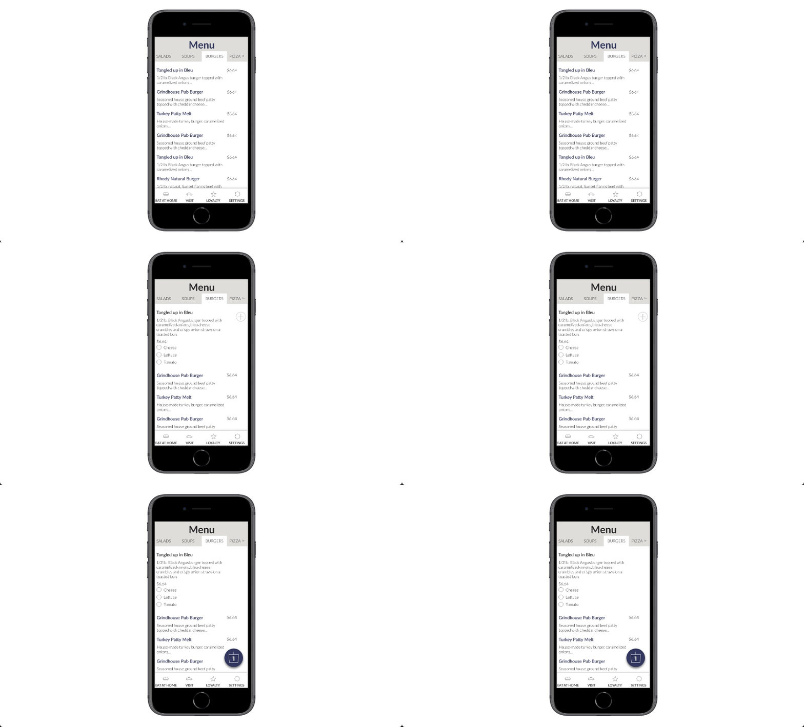
An example of adding delight and clarity with movement in the UI


